Tufte’s principles work as yardsticks for making informative and intuitive visualizations. Typically, in traditions of information design, particularly those represented in business, Tufte’s principles can work as yardsticks for representation. This discussion will illustrate how these principles are in action through three representative examples of business data visualization.
Show the Data
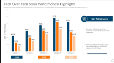
This principle is based on a philosophy that focuses on transmitting information in a manner that is self-contained, directly accessible, and understandable. It hinges on a philosophy of design based on the direct expression of information rather than the embellishment of it. It calls to mind, for all of us who work in information visualization, crafting visualizations with data at centre stage: designing to make these ideas understandable, not to decoy the viewer. An example of this application is a bar chart for comparative year-over-year sales performance highlights. This graph straightforwardly presents sales data, using minimal design elements that could distract from the core information (Tufte, 2019). The bar chart’s clear, concise format allows viewers to focus immediately on the changes in sales figures across different product categories from one year to the next. Using colour differentiates the years while maintaining a simplicity that ensures data remains the focal point.
Make Large Data Sets Coherent
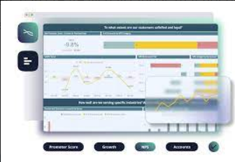
Dealing with extensive data sets poses a significant challenge in ensuring the information remains understandable and manageable for the viewer. Tufte’s principle of making extensive data sets coherent stands for the organization and presentation of data where effectively patterns, trends, and even anomalies can be easily differentiated, especially in large volumes. These range from simple organizational approaches—for instance, summaries and hierarchies—to more complex methods (Tufte, 2019). An outstanding instance of the latter for working practitioners, such as those employing big data to push their brands and products, is presented as an interactive customer behaviour dashboard that neatly captures the concept of “large data sets coherent”. This is an instance of such a total, which tends to encompass scores of other items: complex pieces of software that successfully process colossal swaths of information are arranged into a single interface, through which the user can draw helpful conclusions regarding the satisfaction of customers and the number of such behavioural patterns (Ashraf, 2023). This means that a highly structured approach was applied among the filters to illustrate the large datasets with visual hierarchies and sum it up to demystify and unravel the big data that makes it up incoherently. Friendly usage is therefore possible, facilitating drawing critical insights in a manner that is not overwhelming to the user.
Encourage the Eye to Compare Different Pieces of Data
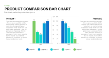
Comparison is fundamental to data analysis, enabling viewers to identify relationships, differences, and trends across data points. This principle is about designing visualizations that naturally guide the viewer’s eye to make these comparisons effortlessly. For visualization practitioners, it means structuring visual elements to highlight comparisons, such as using aligned axes, standard scales, and contrasting colours. An example of this principle is a Product Comparison Bar Chart that reasonably follows the principle of “encouraging the eye to compare different pieces of data.” By presenting data points side-by-side with a standard scale and aligned axes, this chart naturally draws the viewer’s attention to comparisons between the performance of two products over multiple years (Tufte, 2019a). Further contrast is provided, on the other hand, by the existence of contrasting colours to direct people’s attention and eyes to how well the contrasting available metrics compare against those metrics. This makes them analytical in thought and makes a viewer quickly decipher which is better in which respect.
The above various examples of different bettered business data visualization have been in consideration below, having guidance by Tufte in line with principles of information design that ensures better viewing clarity, coherence, and analytic depth improvement. Where the guidelines are followed, the developers create visualizations that effectively put forward data and make clear inferences, further enhancing informed decision-making.
References
Ashraf, M. (2023, October 17). Classic Wisdom in Data Visualization: A Review of “The Visual Display of Quantitative Information”…. Medium. https://medium.com/@maroofashraf987/classic-wisdom-in-data-visualization-a-review-of-the-visual-display-of-quantitative-information-fe8e30afb275
Tufte, E. (2019a). Edward Tufte: Books – The Visual Display of Quantitative Information. Edwardtufte.com. https://www.edwardtufte.com/tufte/books_vdqi
Tufte, E. (2019b). The Visual Display of Quantitative Information: Edward R. Tufte: 9781930824133: Amazon.com: Books. Amazon.com.
 write
write