This discussion goes on to express three of the principles by Edward Tufte on the display of information. The three principles express how to avoid distortion of what the data says, present many numbers in a small space, and reveal data at several levels of detail, from a broad overview to refined structure. In this discussion, I will present my understanding of each principle and its importance to the practice of visualization and provide business data visualizations capturing the principle provided.
Avoid Distorting What the Data Have to Say
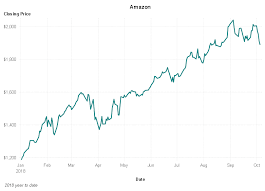
This principle clarifies the need for data to be presented so that it is faithful to the truth of the base information and does not misinform the viewer. In practice, this should be the best choice of what kind of graph or chart is valid and accurately represents the importance of trends or values (Tufte, 2019). For instance, the line graph describes Amazon’s share price over a single year, which is the data’s absolute characteristic without distortion. Since the x-axis is time, then y is the share price. The graph complies with Tufte’s principle by presenting the undistorted veracity regarding how the data behaved with change over time (Sigdel, 2020). It does not fudge with the scales or data points separately to fool the viewer. Instead, it presents facts the way they are and leaves it for viewers to draw relevant inferences concerning the stock’s performance.
Present Many Numbers in a Small Space
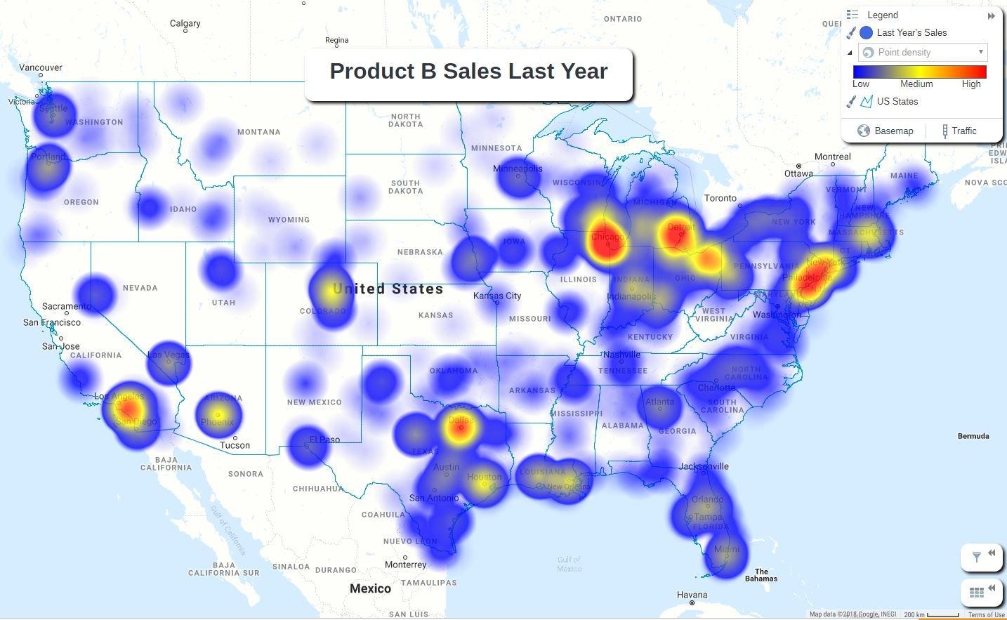
This principle is anchored on communication since it holds the challenge of compressing the complex data set quickly and easily digestibly, just short of oversimplification. It brings in a whole set of tradeoffs that become part of the daily life for the visualization practitioner: between completeness and clarity, between a custom layout and professional design. The best option would be one that gives way to multi-layered graphs or interactive dashboards that hold large amounts of data in a limited area. An example can be shown by a heat map depicting how sales of product B are spanning across the United States (Sigdel, 2020). This is just an example of a very complex data set; sales figures across most regions may be organized in this ingenious yet compact and easily understandable manner. Here again, the color gradient suggests the numbers behind the sales amounts: generally speaking, the warmer colors may mean higher sales, while cooler ones would stand to suggest lower sales. These geographic sales could all be summarized in a table with one image.
Reveal the Data at Several Levels of Detail, from a Broad Overview to the Fine Structure
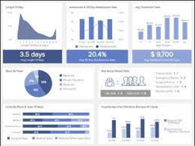
Tufte’s principle here speaks to designing visualizations that cater to varied analytical needs, from the cursory glance to the deep dive. In so doing, the approach will have to call for the design of any visualization tools and their designs that can allow any viewer to effortlessly approximate from the general understanding of the data to its most granular detail. This means having very interactive dashboards that serve high-level summaries but with many options to drill down to specific data points (Tufte, 2019). A case in study for this is the dashboard, replete with lots of data visualizations, epitomizing perfectly this principle. From a glance, it gives a comprehensive look at some business metrics about things like LOS, admission rates, and figures to do with revenue. However, every visualization offers deeper scrutiny of the details. For example, with the help of the bar chart, we can see particular figures for revenue, say, for each month. With the help of the pie chart, the percentage distribution of bed days. It poses information in a classification that goes from summary down to detail, and then on and on, so that viewers first get a holistic view in general and then a deeper concourse down to places of interest.
The above principles of presentation by Edward Tufte underline that there should be integrity, efficiency, and depth in the presentation of data. Such guidelines will help produce good, accessible visualization from complex data that is important in detailing business decisions and strategy formulation. This means that data visualizations are crucial tools of insight for businesses since such principles would only be upheld strictly to the letter, considering the complexities of the information instead of meaning confusion.
References
Sigdel, R. (2020, September 10). Improve Your Visualization Skills Using Tufte’s Principles of Graphical Design. Medium. https://medium.com/nightingale/improve-your-visualization-skills-using-tuftes-principles-of-graphical-design-3a0f40a53a2c
Tufte, E. (2019). Edward Tufte: Books – The Visual Display of Quantitative Information. Edwardtufte.com. https://www.edwardtufte.com/tufte/books_vdqi
 write
write