User Experience, UX
Useful
Every website ought to meet the desired needs of the end users since clients like to interact with a website that can solve their problems and answer their queries (Cheng & Jiang, 2020). Space 220 restaurant has proven helpful to users since it provides information on the various lunch and dinner times for respective calendar dates and the embedded meal pricing for adults and kids. The website also permits the users to view the menu for the day, unique or themed dining, and to check the discounts offered for various meals and drinks. With this information, the user can make reservations depending on space availability. The website also provides the additional necessary information to the clients, including the various adventures available and an outline of the procedures to use while making reservations. Moreover, the GPS location of the restaurant is general on the website. However, the website must provide the available dining plans that individuals can choose from.
In contrast, in the Makihibachi Sushi & Grill, the GPS of the locations of the facility’s branches is provided on the website. Besides, it offers the duration of operations on the respective days of the week. Furthermore, the website allows users to view the various food items available and the associated price tags in both lunch and dinner menus as well as permits the users to make an online order for deliveries to specific destinations. The facility has a working partnership with Uber Eats and NanoDelivery, which the users can use to choose the best delivery platform.
Usable
According to Molinillo et al. (2021), the ease with which various users can navigate the website while looking for relevant information is crucial in any design. As such, Makihibachi’s website has menu bars that aid users’ navigation, including the menu, order now and delivery options. Equally, suppose a user clicks on any food items in the lunch and dinner menus; they can either do a review or place an order. If the user opts to do a review, the website submits it to the system admin for ratification. Otherwise, if they choose to make an order, they are directed to the delivery options and payment methods. However, the website does not have navigation tools embedded in it except for the standard enabled back and forward icons.
In contrast, the space 220 restaurant has minimal navigation features. The website is essentially static, which does not permit user input; the users can only view the content. There is no connection between the web pages since each operates independently. Users are limited to using the standard navigation icons of forward and back website browsing.
Findable
According to Redjeki and Affandi (2021), users should be able to quickly look for items on the website, which often a search menu achieves. However, the users should find the information faster and easier whenever a client searches. Space 220 restaurant has all its presumed users’ necessary information on its front page, including the various available adventures and reasons that warrant cancellations, the meal prices, and the times of operations each day. It is also easy to find the restaurant’s different foods, including each price tag. However, establishing whether all these meals might be available every day is not illustrated on the website. Moreover, the website lacks a search menu that lets users find items based on keywords. The availability button does a little better in finding things within the website since it only prompts the user to either sign in or sign up.
In the case of the Makihibachi website, there is a provision for finding the restaurant’s direction as provided on the website. Finding the food items available for each day’s dinner and lunch menu and the associated price tags is also easier. It is also easier for users to make online orders via the order now menu or by selecting a particular food item from the populated food menu for both lunch and dinner—furthermore, the various delivery options direct users to the corresponding platforms independent of the restaurant’s website. The website also permits users to register with the restaurant to become part of the workforce, a member, or be among the VIP members. However, just like the space 220 restaurant, the website lacks a search menu that would enable users to look for items within the website based on some keyword(s).
Credible
According to Qalati et al. (2021), credibility is the trust users associate with a website. Space 220 restaurant needs to be more credible since its information is static. A given user may perceive that the information contained in it might have been there for years and years without any alteration. Moreover, since it does not permit interactions with the user, the trustworthiness depreciates even more. However, the Makihibachi website looks credible since it is dynamic and allows user interactions. The website can provide different food items for daily menus (lunch and dinner). The users, as such, can make daily choices, not necessarily customized to defined food items presented in space 220 restaurant.
Desirable
Makihibachi Sushi & Grill looks appealing based on its home page’s various dynamically enabled pictures. The pictures display the quality of the food items that the facility offers. Moreover, the color themes blend and show the ambiance and tranquillity a given user expects to witness at the facility. The arrangement of the various menu bars also offers quick glancing and navigation techniques that the users need to make, making it even more desirable. Moreover, the website gives the user countless food menu options to choose from and make orders, besides having a linkage with the delivery entities. However, space 220 restaurant has static pictures on its home page that users must navigate independently. Besides, the website only permits providing a bit more information on the various foods and further needs a mechanism for doing online orders and delivery. In comparison, the Makihibachi website is more desirable to the users than the space 220 restaurant website.
Accessible
Anyone can access the information available in space 220 restaurant without any restriction. The same case applies too to the information available on the Makihibachi website. However, only the Makihibachi website has factored information accessibility for people with disabilities, including the visually impaired and physically challenged persons who need more sound than visual interaction. For instance, they have indicated their website as “Website Accessibility Assistance” at the bottom of the website. In contrast, Space 220 Restaurant does not have this provision on its website. However, both websites offer the read-aloud option and text color filter whenever any highlighting is required. The two websites also do not permit any form of text or image magnification.
Valuable
The Makihibachi website permits users to sign up for their system to access their services. Moreover, it also allows users to submit their reviews and feedback through an enabled form at the end of the home page screen. These reviews are the information that the website admin and the hotel management use to effect improvements and keep the clients locked. According to Rahi et al. (2020), every website is built better through feedback that it receives from the users.
Space 220 restaurant has limited interactions with the user since it does not have a review or feedback provision mechanism. It may be hard to evaluate if the website is valuable and meets the user’s needs. However, the website permits users to either sign in or sign up to make reservations for particular adventures and dinner setups. Both websites allow users to sign up using social media accounts, including Facebook and email accounts (Gmail), which limits users’ involvement in terms of time duration and the specific details required for registration.
Information Architecture
Organization Schemes and Structures
Makihibachi’s website structure is in coherence with the standardized website development structure. The various menus appear on top of the website and feature on all the web pages—moreover, the picture displays and places the associated information within the website. The website maintains minimum use of colors and conformity throughout the web pages. As a principle design rule, an organization must place the user reviews and feedback at the far end of the website’s home page, where it can establish the various linkages to the restaurant’s social media pages. Makihibachi is an example of a website that adheres to User Interface (UI) design and User Experience (UX) needs.
In contrast, Space 220 Restaurant only has a portion of the established website, and, as such, the development team ought to factor in much of the design parameters. The website has no menu or menu bar, but at least its information is displayed appropriately, combining texts and pictures. The website also has GPS location details at the bottom of the home page, which conforms to the required standards.
Labelling Systems
The labeling used in the two websites conveys the appropriate message and the intended purpose—the links embedded in the labels work. However, space 220 restaurant had fewer labels and menus than Makihibachi. The menu items on the makihibachi website contain the appropriate information and can direct a user to the webpage and service. Both websites have to submit buttons with different texts but perform similar functions of transferring data to the relevant databases, such as the sign-up and sign-in procedures.
Navigation Systems
Both the space 220 restaurant and Makihibachi websites did not implement navigation icons within their design. Instead, they relied on the standard icons provided by the browser framework of back and forward icons. However, Makihibachi provided navigation by linking a given webpage to another, as was provided for when ordering a food item online and providing reviews. A given user can select a given food from the menu provisions, and the website directs them to the following webpage that will permit the user to either review or make an order. Upon completing an online order, the user must access the delivery options with a universal resource locator (URL) reference to the selected and specific company that provides such services.
Search Systems
ebsite The search system was not made available on the two websites. It is difficult for users to look for items or information on these websites. Presumably, the designers had established that the information on the website would be retrieved easily by the users. It would not be possible for the website to hide the information within it.
Recommendations
Space 220 Restaurant
The website requires an independent domain name and space. The website needs to be dynamic with a functional database at the back end, allowing users to query the website on any of their needs. Further, the website should factor in the needs of the visually impaired and other disabled individuals in its architecture. A feature that the site needs to include is the ability to have the users order food items online besides being able to choose different delivery mechanisms to respective destinations. Moreover, the website must implement a system that only displays food items available for either lunch or dinner daily rather than populating its list with everything. The website must also use a search system where users can find information through keyword(s). The website should also have defined menus linked at the menu bar. By providing a reviews/feedback section at the bottom of the website, users can interact with the website by offering their input whenever needed. Linking the established web pages should be made a priority.
Makihibachi
For this website, all the established functions need to be made active to perform the intended tasks, such as the tasks related to online delivery do not respond. Otherwise, the website is suitably made and developed.
Personas
Space 220 Restaurant
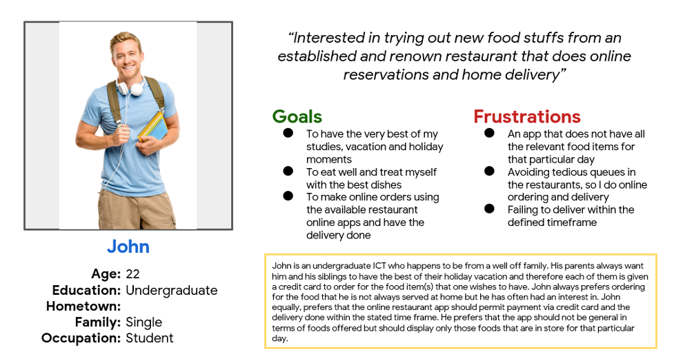
I had a random conversation with one of my friends, who is from a wealthy family, on how they, as a family, spend their holidays and vacations. He told me that the parents let them free to choose how each would love to spend such occasions. At this point, he disclosed that he prefers online ordering food items that are not usually prepared at home but has always been interested in them. He always wants these food items delivered to his doorstep within the defined timeframe. He also wants to choose based on the available foods daily and, as per the menu interest, either lunch or dinner. He also noted that it would be better if such an app for ordering and delivery permits online transactions since his parents do not give him cash but a credit card to use.
Figure 1 below shows the pictorial illustration of the Space 220 Restaurant persona.
Makihibachi
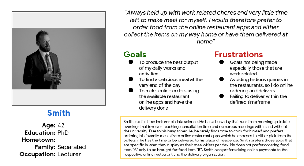
I began conversing with my single lecturer, who has a busy work schedule, including lecturing, student consultations time, research, and numerous meetings with varied individuals. He disclosed that cooking is a toll order in his timelines and often prefers getting food from the available restaurants. He likes picking up the takeaway as he proceeds home or making an order, and the company delivers it to his doorstep. According to him, if he could get a restaurant app with different foods for different menus (lunch and dinner) and specific days, he would be the first client of such a restaurant. He attributes his preference to some of the many orders he has done in the past and the company have been rejected at the very last minute because of the unavailability of the food item that he wanted. He has had to change food items regularly since most restaurants do not do refunds.
A persona illustration for a Makihibachi client is shown in Figure 2 below.
Sitemaps
Makihibachi Sitemap
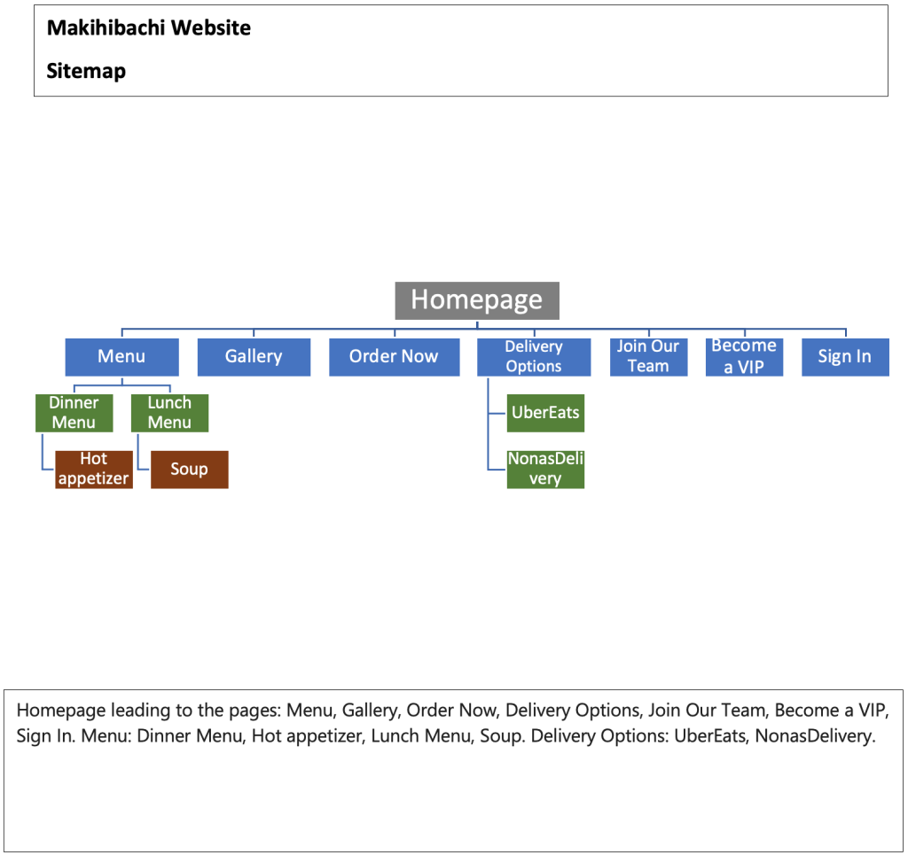
The website had seven web pages on its home page, including the menu, gallery, order now, delivery options, join our team, become a VIP, and sign in, as illustrated in Fig. 3. Further, the Menu page had other linkages attached to it including dinner and lunch menu which had various food items embedded unto them including hot appetizer and soup. Moreover, the delivery options page has two choices the users can make: Uber eats or Nona’s delivery which directs the user to the independent websites upon being clicked.
Space 220 Restaurant
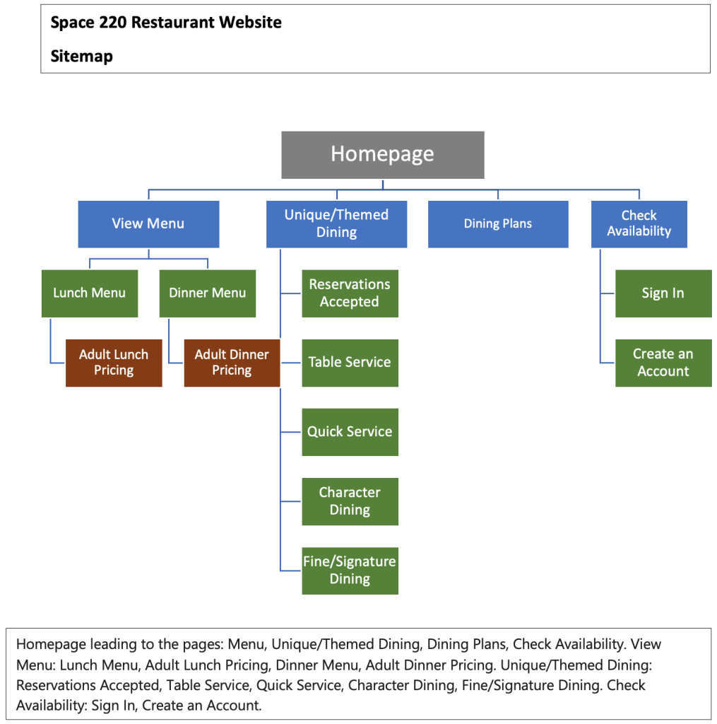
This website home page has four different linked pages, including the view menu, unique/themed dining, dining plans, and a check availability button, as depicted in Fig. 4. Further, the view menu had submenus within it, including lunch and dinner menus which are further divided into either adult lunch or dinner pricing with the embedded food items as shown in Figure 4. The unique/themed dining comprises reservations accepted, table service, quick service, character dining, and acceptable/signature dining, as illustrated in the figure. The check availability page has either a sign-in or create an account portal that the users can use to register with the website or log in for already registered users.
Wireframes
Wireframes show the visual design of the existing and the proposed ideal system layout.
Space 220 Restaurant
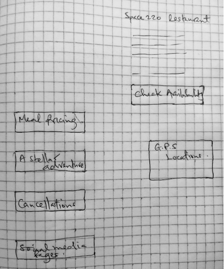
The current design for the space 220 restaurant is shown in Figure 5 below. This design needed to be more user-friendly and factor in most of the crucial elements expected of an online restaurant.
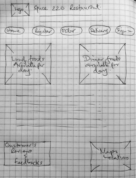
However, Figure 6 below shows the proposed design that space 220 restaurants shall have. This design has factored in most elements missing in the present scenario.
Makihibachi Restaurant
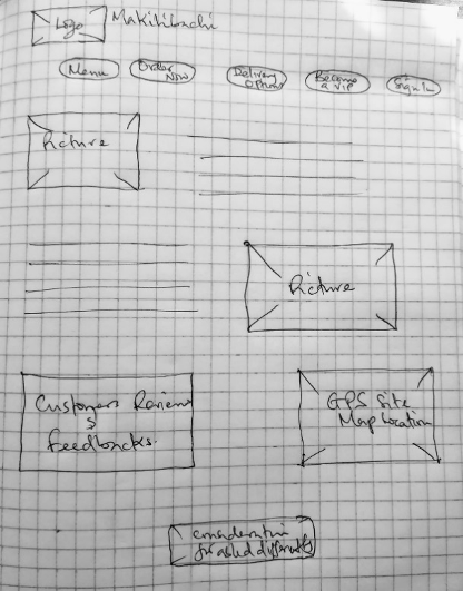
This website was made to the standard format and requirements. However, only some elements had no connection to the established database or were just left unattended. Figure 7 shows the current wireframe for the Makihibachi website.
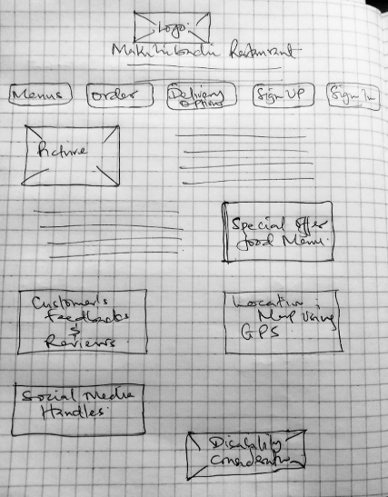
However, in the new proposed design, an aspect of the facility’s social media handles has been incorporated, as shown in Figure 8.
References
Cheng, Y., & Jiang, H. (2020). How do AI-driven chatbots impact user experience? Examining gratifications, perceived privacy risk, satisfaction, loyalty, and continued use. Journal of Broadcasting & Electronic Media, 64(4), 592-614.
Molinillo, S., Aguilar-Illescas, R., Anaya-Sánchez, R., & Liébana-Cabanillas, F. (2021). Social commerce website design, perceived value, and loyalty behavior intentions: The moderating roles of gender, age, and frequency of use. Journal of Retailing and Consumer Services, 63(C), 102404.
Qalati, S. A., Vela, E. G., Li, W., Dakhan, S. A., Hong Thuy, T. T., & Merani, S. H. (2021). Effects of perceived service quality, website quality, and reputation on purchase intention: The mediating and moderating roles of trust and perceived risk in online shopping. Cogent Business & Management, 8(1), 1869363.
Redjeki, F., & Affandi, A. (2021). Utilization of digital marketing for MSME players as value creation for customers during the COVID-19 pandemic. International Journal of Science and Society, 3(1), 40-55.
Rahi, S., Ghani, M. A., & Ngah, A. H. (2020). Factors propelling the adoption of internet banking: The role of e-customer service, website design, brand image, and customer satisfaction. International Journal of Business Information Systems, 33(4), 549-569.
This website was made to the standard format and requirements. However, only some elements had no connection to the established database or were just left unattended. Figure 7 shows the current wireframe for the Makihibachi website.
 write
write