Introduction
A music service often serves various users, each with unique interests, motives, and requirements. Several common traits and reasons can be connected with building playlists on music streaming services, even though the target consumers can vary depending on the platform (Greenberg 2021). Let us examine the overview of the target audience and the drivers behind their playlist creation:
Simple Listeners
Casual listeners use music for amusement and leisure but may need to be more passionate or knowledgeable about a particular genre or performer. The reasons behind playlist creation: For different moods or events, such as workouts, parties, calming music, or road trips, casual listeners frequently make playlists (Baracskay 2022). They look for playlists that can offer a convenient and pleasurable listening experience without requiring them to organize their music library (Anderson 2021) carefully.
Lover of Music
Music lovers actively explore many genres, performers, and styles and passionately love music (Knijnenburg, 2022). They might have a larger music library and devote more time learning about new songs and musicians. The reasons behind playlist creation: Music lovers make playlists highlighting their preferred tunes, musicians, or musical subgenres. To construct a special musical experience and share their musical preferences with others, they could make playlists that emphasize a specific theme, era, mood, or sub-genre (Jaakkola, M., 2020).
Influencers and Curators
Curators and influencers actively participate in the music industry and have a talent for finding up-and-coming musicians. They frequently have a fan base or a musical presence on social media (Magaudda, P., 2021). The reasons behind playlist creation: To share their knowledge, offer new music to their fans, and support artists they believe in, curators and influencers make playlists. These playlists frequently contain a thematic or philosophical focus, aiding in developing the listener’s distinct musical personality (Antunes, M 2021).
Overview of Spotify and YouTube and Their Reasons
YouTube:
Users can access a wide range of content on YouTube, such as music videos, live performances, covers, and other types of videos. YouTube users make playlists for various reasons, including collecting their favourite music videos, live performances, or original works in one location (Jaakkola, M., 2020). On YouTube, playlists are frequently used to construct audiovisual experiences, share musical discoveries, or arrange content for certain events or purposes (Gibson 2021).
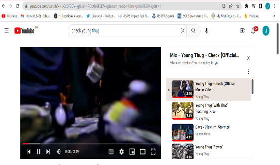
Spotify:
Spotify is a music streaming service with a vast library of songs, albums, and playlists spanning many genres. With playlists, Spotify users may customize their listening experience, compile collections of their favourite songs, receive algorithmic recommendations for new music, and communicate their musical tastes to friends and followers (Shapiro 2021). Spotify playlists can be used for collaborative curating with others, mood-based listening, genre research, artist appreciation, and more. The value of playlists as a means for people to interact with music uniquely and meaningfully is acknowledged by both YouTube and Spotify (Soares, 2021). On these platforms, making playlists is driven by the desire to express one’s musical interests, organize content, find new music, share it with others, and offer personalized listening experiences (Anderson 2021).
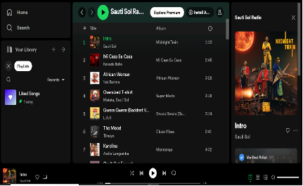
A heuristic evaluation can offer insightful information regarding the user experience when comparing and analyzing two websites, such as Spotify and YouTube, for their usability (. A website is evaluated using established usability heuristics or concepts as part of a heuristic evaluation (Au-Yong-Oliveira 2021). Here is an illustration of a heuristic comparison between YouTube and Spotify:
- The system state is easily visible.
- On Spotify, the playback controls are displayed at the bottom of the screen, showing the music’s current playing status (Semerci, O 2021). The song title, artist, and album information are visible to users (Gomes, 2021).
- YouTube: The video’s title, view count, and like/dislike ratio are clearly shown on the player’s interface. The playback controls’ visibility should be enhanced, though, as they are occasionally concealed until the user interacts with the movie (Jaakkola, M., 2020.).
- System and real-world alignment:
- Spotify: The user interface uses identifiable iconography corresponding to users’ mental models of music playback, such as play/pause buttons and forwards/backward icons. Users can quickly comprehend and use these controls because they are common (Wolf S, 2021).
- YouTube: The controls for the video player use distinct icons, including play/pause buttons and a timeline, which are in keeping with what viewers anticipate from video playback (Jaakkola, M 2020).
- User freedom and control:
- Spotify users may add, remove, or reorder music from their playlists and have complete control over them. The interface offers a simple method for making and managing playlists (Pereira, L 2021).
- YouTube: Viewers can scroll ahead or backward in the video and choose how it plays. Although the UI does not offer as much freedom as Spotify’s, there is room for improvement in managing playlists and categorizing videos (Magaudda P, 2021).
- Uniformity and standards:
- Spotify’s interface, which follows a defined design and navigation scheme, is consistent throughout the application. Users can anticipate consistent interactions and design themes throughout the app’s many areas (Semerci O 2021).
- YouTube: The user interface needs fixing, particularly in the navigation and layout between the web and mobile versions. A little fragmented user experience results from the different design patterns and user interactions (Anderson 2021).
- Error prevention and recovery:
- Spotify: When a song cannot be played or when there is a network issue, the app displays useful error messages. It presents alternatives to keep the music playing or options to do the action again (Gil, S 2021).
- YouTube: The recovery options on YouTube should be enhanced. However, the problem notices are typically fairly clear. When playback issues occur, users are frequently redirected to the site or presented with irrelevant content (Wolf, S 2021).
This heuristic rating is based on comparing the two websites, known usability criteria, and critical and analytical thinking. It assists in identifying usability strengths and shortcomings (Antunnes, M 2021). It’s crucial to remember that a comprehensive assessment would need extra study, user testing, and the consideration of particular user demands and settings.
Usability Report and Actual Linkage to Axure RP
Identification of Formal Evaluation Criteria Sets
This study utilized Nielsen’s heuristics as the basis for assessment. To gauge how well a system works, we will be looking at how well it displays system status, how well it corresponds to the real world, how much control and freedom it gives users, how consistent it is, how effective it is at preventing errors and recognizing when users have made mistakes, how adaptable it is, how aesthetically pleasing it is, how (Meggetto et al. 2021 p.3333). Hence, Benyon’s guidelines also considered: user-friendliness; clarity; feedback; content; relevancy; ease of learning and retention; controllability; ease of navigation; and aesthetic appeal (Benyon, 2010). Both YouTube Music and Spotify were evaluated using these characteristics, which are fundamental for gauging the effectiveness of interactive systems, as shown below.
The report’s assessment criteria are derived from Nielsen’s heuristics. To gauge how well a system works, we will be looking at how it displays system status, corresponds to the real world, the control and freedom it gives the user, how consistent it is, how it adheres to standards, prevents errors, how well it uses recognition to avoid recalling previous mistakes and how efficient it is, (Meggetto et al. 2021 p.3333).
I utilized Nielsen’s heuristics, ten criteria for assessing interface usability, to determine the intuitiveness of both YouTube Music and Spotify. Principles include system status transparency, system congruence with reality, user agency and autonomy, uniformity and guidelines, error prevention through appreciation rather than recall, adaptability and efficiency in use, beauty and simplicity in design, assistance in recognizing and fixing problems, and thorough documentation. In 2022 (Baracskay, et al., p.97). I also considered Benyon’s guidelines, which comprise these eight factors: usability, readability, feedback, content, relevancy, learnability, uniqueness, navigation, degree of control, and aesthetics (Benyon, 2010). These assessment criteria were applied to the usability of both YouTube Music and Spotify because they are essential for assessing the effectiveness of interactive systems, as demonstrated below
Evaluation and Comparison of YouTube Music and Spotify
Several research techniques, including surveys, interviews, and user testing, can be used to learn more about the target consumers’ traits, actions, and objectives for YouTube and Spotify. An illustration of user research done for both platforms is provided here:
Surveys:
An online survey was conducted to learn more about the demographics, usage patterns, and motivations of YouTube users. Users’ viewing habits, frequency, and motivations for using the platform were all the subjects of the questions. Sent a similar questionnaire to Spotify customers, focusing on their musical tastes, playlist-making routines, and reasons for using the service.
Interviews:
A sample of YouTube viewers was subjected to in-depth interviews to learn more about their objectives and behaviours. Explored subjects like preferred forms of entertainment, finding content, and playlist-making practices. Likewise, interviews with Spotify customers were conducted to learn more about their listening preferences, playlist creation processes, and reasons for utilizing the service.
User testing:
Sessions for usability testing were held with users of Spotify and YouTube. Observed how people interacted with the platforms, discovered any pain points, and gathered comments on playlist-related features.
The following two UX personas can be made based on the research findings:
“Entertainment Enthusiast” is the first persona.
Characteristics: Young adult (ages 22 to 30), frequent social media user, and avid content consumer. Spends a significant amount of time each day on YouTube, where they explore different genres, interact with producers, and share their favourite videos with friends. Aims to find enjoyment, find new content, and remain up to speed with popular videos. Relevance to the music service and playlist creation: This persona may use YouTube to look for new music, follow relevant channels, and make playlists for various situations or moods. They are going to create and distribute music playlists among their friends.
“Music Aficionado” is Persona 2.
Any age group can enjoy music. However, dedicated music streaming services are preferred. Actively investigates and follows musicians.
Behaviours:
Actively shares music recommendations, uses Spotify as their main music streaming provider, and makes and organizes various playlists. Discovering new music, making custom playlists, following favourite musicians, and expressing their musical preferences to others are all goals.
Relevance to the music service and playlist creation:
This persona is passionate about music and utilizes Spotify to create playlists tailored to particular moods, activities, or musical genres. To improve their playlist-building experience, they are likely to look for options like collaborative playlists and sophisticated music recommendations. Based on the research findings, these personas represent various user types and aid in empathizing with YouTube and Spotify’s target audience. They emphasize the value of playlist creation for users and the significance of features and functionality tailored to their musical preferences and objectives.
Discussion of Take-Aways and Guidelines
It was determined via the usability testing that the new music service’s low-fidelity prototype should emphasize user agency and choice, recognition over recollection, and adaptability and efficacy. Error mitigation and standardization in the prototype’s design are also essential.
Visibility of System Status
A musical streaming app, the q app prototype made on Axure offers some essential elements to improve the user experience. The pages that make up the prototype are as follows:
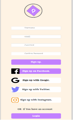
- Login and Registration Page- Users can access the app by logging in with their credentials or making a new account.
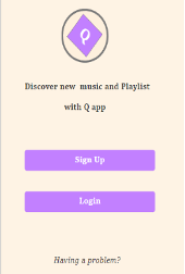
The login and registration page should have simple directions and user-friendly input fields.
- Music Player Page: This page offers customers an aesthetically pleasing and straightforward interface for playing music. The music player should have play/pause, skip, and volume control features. In order to create an immersive experience, synchronized lyrics should be displayed alongside the music.
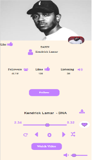
- Video Player Page: On this page, users can watch music videos with lyrics that are synced to the music. The video player should enable fluid playback and provide controls for volume adjustment, play/pause, and seek. The viewing experience can be improved using full-screen mode and video quality options.
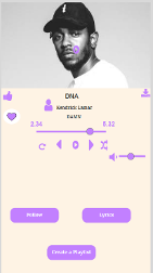
- Liked Music Page- The music the user likes is listed on this page. The ability to sort and filter by artist, genre, or date added allows users to browse and manage their favourite tracks. Adding songs from the liked songs collection to playlists should be possible directly.
- Users can create, manage, and organize playlists on the playlist creation page. The interface must allow users to add, remove, and reorder music in playlists. Features for sharing and working with friends can be incorporated into collaborative playlist production.
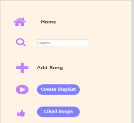
A seamless and customized music streaming experience is the main goal of the outlined prototype. It has functions including synchronized lyrics, video playback, and playlist generation to accommodate different user demands and preferences. The prototype can be used as a starting point for additional development and refinement, combining user feedback and usability testing to guarantee a user-friendly and captivating result.
Conclusion:
The results of the usability tests conducted on Spotify and YouTube Music underlined how simple and straightforward it is to create playlists on both services. However, Spotify showed certain benefits in terms of functionality and usability. The mid-fidelity prototype for the q app should consider the following principles in light of these findings: Users should be able to search for and add entire albums to their playlists using a tool that supports this. This feature makes it easier to create playlists by providing a wider variety of music from particular artists or albums.
User-Generated Music Tracks Should Be Included: Add a search feature that enables users to look through and add music tracks made by other users. Within the music streaming app, this function develops a sense of community and promotes collaboration. Streamline the playlist generation interface by making it simple, intuitive, and easy to use. To assist users in adding, deleting, and rearranging music in their playlists, utilize clear instructions and visual clues. The q app complies with the rules mentioned above thanks to its login and sign-up pages, music player page with synced lyrics, video player page, liked songs page, and playlist creation page. The q app strives to give music lovers a seamless and delightful experience while creating their playlists by integrating these capabilities and emphasizing user-friendliness.
Developing two user experience (UX) personas also gives the design process more depth and comprehension. With the aid of these characters, the q app can better respond to the desires and habits of ordinary users, resulting in a unique and interesting music streaming experience. Overall, the development team can concentrate on building a simple and user-friendly music streaming platform that allows users to create their playlists by considering the usability test findings, instructions for the mid-fidelity prototype, and incorporating the q app.
References
Anderson, I., Gil, S., Gibson, C., Wolf, S., Shapiro, W., Semerci, O. and Greenberg, D.M., 2021. “Just the way you are”: Linking music listening on Spotify and personality. Social Psychological and Personality Science, 12(4), pp.561-572. https://journals.sagepub.com/doi/pdf/10.1177/1948550620923228
Baracskay, I., Baracskay III, D.J., Iqbal, M. and Knijnenburg, B.P., 2022, March. The Diversity of Music Recommender Systems. In 27th International Conference on Intelligent User Interfaces (pp. 97-100). https://dl.acm.org/doi/abs/10.1145/3490100.3516474
Gomes, I., Pereira, I., Soares, I., Antunes, M. and Au-Yong-Oliveira, M., 2021. Keeping the beat on: A case study of spotify. In Trends and Applications in Information Systems and Technologies: Volume 2 9 (pp. 337-352). Springer International Publishing. https://link.springer.com/chapter/10.1007/978-3-030-72651-5_33
Jaakkola, M., 2020. From vernacularized commercialism to kid bait: Toy review videos on YouTube and the problematics of the mash-up genre. Journal of Children and Media, 14(2), pp.237-254. https://www.tandfonline.com/doi/abs/10.1080/17482798.2019.1693409
Magaudda, P., 2021. Smartphones, streaming platforms, and the infrastructure of digital music practices. In Rethinking music through science and technology studies (pp. 241-255). Routledge. Link
Meggetto, F., Revie, C., Levine, J. and Moshfeghi, Y., 2021, October. On skipping behaviour types in music streaming sessions. In Proceedings of the 30th ACM International Conference on Information & Knowledge Management (pp. 3333-3337). https://dl.acm.org/doi/abs/10.1145/3459637.3482123
Roth, C., Mazières, A. and Menezes, T., 2020. Tubes and bubbles topological confinement of YouTube recommendations. PloS one, 15(4), p.e0231703. https://journals.plos.org/plosone/article?id=10.1371/journal.pone.0231703
Shang, L., Zhang, D., Shen, J., Marmion, E.L. and Wang, D., 2021. CCMR: A Classic-enriched Connotation-aware Music Retrieval System on Social Media with Visual Inputs. Social Network Analysis and Mining, 11, pp.1-14. https://link.springer.com/article/10.1007/s13278-021-00821-4
Siles, I., Segura-Castillo, A., Solís, R. and Sancho, M., 2020. Folk theories of algorithmic recommendations on Spotify: Enacting data assemblages in the global South. Big Data & Society, 7(1), p.377. https://journals.sagepub.com/doi/pdf/10.1177/2053951720923377
Vlad, M., 2021. Music press in the digital age. Social Sciences and Education Research Review, 8(1), pp.240-250. https://www.ceeol.com/search/article-detail?id=1044436
 write
write