CHAPTER 1
Introduction
Brief overview of Denis Villeneuve’s filmography
Denis Villeneuve is one of the brightest stars in modern cinema who has developed a voluminous and complex cinematography about his intellectual sophistication and feelings of depth. Villeneuve was born in 1967 in Canada and attained worldwide fame as the director of a series of visionary movies. His first films, such as “Maelström” (2000) and “Polytechnique” (2009), demonstrated his unique approach to conveying challenging subject matter while adopting a distinctive visual idiom. However, in ‘Incendies’ (2010), Villeneuve earned international recognition and received an Academy nomination for Best Foreign Language Film. Other successive projects, such as “Prisoners” (2013) and Sicario (2015), further solidified Denis Villeneuve’s status as an Australian director with outstanding, atmospheric tales to tell. His first step into science fiction with “Arrival” (2016) and the visually impressive ‘Blader Runner 2049′ was to demonstrate that Villeneuve could do any genre, a master of film. In addition to his directing accomplishments, Villeneuve’s movies are characterized by existential questions that lead people to a more profound understanding and thinking (Matt, 2023).
Denis Villeneuve provides a colour evaluation canvas with the help of his movies Blade Runner 2049, Arrival and others. In cinematography, colour is not only a matter of sensory gratification; it can unconsciously imbue images with feelings and manipulate viewers’ perceptions. This essay claims that understanding the subtext of colour in Villeneuve’s films is essential to assess his talent as a director thoroughly.
Importance of colour in filmmaking
In filmmaking, colour takes the place of is paramount not only as an attractive feature but also as the most potent tool for narration (Matt, 2023). It is a silent language that conveys feelings, builds atmospheres and supports narrative themes. The choice of colour schemes in films is intended to evoke specific emotions that produce particular moods and various emotional messages (Frkáň, 2020). Hence, how viewers perceive and analyze an episode becomes governed by the psychology of hue. In cinematography, the colour palette may symbolize archetypes of certain characters, applause for some plot developments and visual connections related to the theme. For instance, warm colours signify intimacy or passion, while cold hues symbolize detachedness and mystery (Risk, 2020). For clarification, the attributes of premeditation in the shade can provide storytelling through contextual colours that produce calm signs and visual metaphors, which spice up viewership.
Moreover, colour contributes to the overall aesthetic of a film; it alters its visual style and engraves memories into people’s heads (Zhang, 2020). In this respect, the use of colour by the filmmaker defines his style as a distinctive mark for every movie he would produce in future. The importance of colour or filmmaking has a deeper meaning in that it can go beyond appearance and become part of the narrative, which assists the audience’s understanding through their perception of events developing over the screen.
CHAPTER 2
The Language of Color in Villeneuve’s Films
The visual storytelling of Denis Villeneuve is related to his well-considered, delicate and technically powerful approach to colour– placing the films beyond that level of pure ‘eye candy’ towards a higher cinematic plane. The surface of his director’s canvas turns into a life-filled space where paints are successfully created, emotions and stories – this is how, as an artistic individual, a unique sign emerges far beyond aesthetic choices. Villeneuve’s use of colour is a means that transcends the notion even beyond storytelling; it becomes its dialect, which speaks directly to viewers (Bartos, 2020). Each film in the bibliography is a separate chapter of this exploration that indicates changes in cinematographic directorial evolution and thematics found within the main storyline. First, these specifically selected shades are a thematically developed concept because they incorporate emotional undertones in narration with each story colour.
Villeneuve’s colour palette helps tell the story as a vehicle for what each tale tries to convey thematically, from the dystopian vibrancy of “Blade Runner 2049” through contemplative subtlety in ‘Arrival’ and tension-filled landscapes with Sicario (Baker, 2021). It shows his dedication to immersive storytelling, in which every colour and shade is deliberately selected to convey designated feelings or improve the viewer’s relation to the plot. Indirectly, Villeneuve’s language of colour turns the screen into a living canvas upon which every frame is its stroke that contributes to the deep emotional and narrative penetration caused by his cinematic works.
Blade Runner 2049 (2017)
The visual symphony embodied by the filmmaker Denis Villeneuve’s “Blade Runner 2049” is primarily due to the clever and powerful use of a neon-soaked colour scheme. Released in 2017, this art film could be a sequel to the famous “Blade Runner” but is an independent production that may complement it with its breathtaking visuals. Villeneuve and Roger Deakins Blade Runner is the dystopian world of marvellous neons cold blues; however, a colour palette beyond mere visual conditions creates substructures within which roaming themes flow throughout this screenplay while underlying emotional highlights rise at peaks over.
This cold blue all over the new Los Angeles cityscape depicted in this movie cannot help but be seen, even though people feel emptiness and desolation (Elyamany, 2023). The strange radiance of large holographic commercials that flash a frightening glare is what seems to cling to this artificial situation. Villeneuve uses blue notes to enlarge the emotional gap in his story. When the divide between human and replicate is thin, as it becomes in a world where reality gives way to illusion, when man wrestles with their tenuous nature of existence for what defines life itself: The icy blueness in psyche reflects them with sudden stillness. With several foreshadowing of and ambivalently tensed motion moments, red colour distribution contributes to its key points. The orange glow is almost overpowering with situations in Wallace Corporation as part of this generation’s imaginary person. These scenes give an overwhelmingly uncomfortable setting for darkness within that story. Villeneuve uses warmth to humanize the robot/human interaction, creating another tone showing strange ethical difficulties in Blade Runner (DiGioia, 2021).
The colour does not cover the whole of Blade Runner 2049 for an ornamental purpose but as a communication technique that fulfills its function to convey alienation and produce an impression of something painful in reality, an existential problem shared by every character from this film. Blues are cold, and oranges heat up, reflecting mirroring emotions that arise in nature from the character of personality. A whole luminous heap of urban dreams, merged with the glow of wonder, presents a human alienation concept brought about by gloom and mystery in life gives to it that holds them from living unconcerned about the present.
However, the visual language in “Blade Runner 2049” does not function within any bounds that a storyboard can provide. It becomes a psyche one-way channel about which the audience sees and sympathizes with their characters’ pains deep in themselves—the flora internally would be included for better or worse after usage of The with neon shining on city illuminates natural storyline to many humans who gather around centers, street lamps pulse images by rhythms reflected from brilliant hues through colours that This is seen in his being alone through the story thus highlighting and revealing K’s lifestyle which usually tends to be over shaded by cold blues. On the other hand, oranges give off heat and infuse it in these moments of confession into our emotional identity.
Arrival (2016)
Firstly, Arrival by Denis Villeneuve could be called one of the true gems in the science fiction genre because this movie touches upon an enigmatic subject – alien contacts and also possesses a genius directing approach by using pastel colours throughout this movie. First, because 2016 was its year of release, some credit is due to Villeneuve achieving an excellent visual final effect with such an extraordinary idea toward his depth (Dridi, 2023). Using cinematographer Bradford Young in the film “Arrival,” Villeneuve creates a limited colour palette, almost utterly unimaginative and very earthy. This deliberate choice of subdued tones serves a dual purpose: Indeed, it brings a bit of psychological validity to characters and positions itself as visual media for the average viewer travelling with the protagonist along the route towards understanding alien signal.
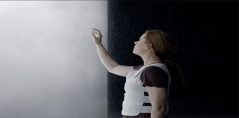
Amy Adams in “Arrival” (2016, Denis Villeneuve); photo courtesy of IMDb.
From the first subdued colours in coming, a movie has had one characteristic of reflecting and meditating. But this is also a primal tapestry that invoked rustic ill-shaped boundaries that have delineated the main character, Dr. Louise Banks, as Amy Adams and that she was missing her father for some years. They left a small piece of sorrow behind, which was put away by biochemical remains. Villeneuve mutes this colour palette in Arrival; therefore, it is not a mere aesthetic preference that creates something new through the dramatized motifs. It serves two functions for his story – to reveal each character and their beliefs about themselves separately (Matt, 2020). However, when the main character travels through time and natural language communication, such a thing as meaning becomes clear in case of empathy, not opposed to involvement in developing relation with the viewer.
Second, the muted colour palette focuses on minor expressions that can help to create. When Amy Adams portrays Dr. Louise Banks, the range of feelings goes from along such lines of surprise with a gaping mouth visualizing paralyzed incapacity to perhaps despondency moving close towards submission that it handled, but now this quick rewind in lieu temporarily thinking life thoughts through a lifetime. The soft-toned colours scream as background but are painted on them in sharp relief of all emotions (Matt, 2023). At the heart of Adams’ artistry, in its interaction with subdued colours, a character is brought to life by means that engage an audience on a far deeper level than allowed for by any rules defining which genres do or don’t belong within science fiction.
Besides, the subdued colour scheme is integral to realizing a visually engaging and mesmerizing ambience where everything seems to fit together. With her metabolic analysis becoming a growing focus, the muted colours assume an abstract symbolical significance that reflects the hidden layers of mysteries. Though Villeneuve uses muted colours to conjure an air of mystery and intellectual enigma, he gives the audience a chance, basically asking them for their participation in what is his protagonist’s cerebral journey. Moreover, ‘Arrival’ has a nature-oriented tone because of the earth’s colours. The tones are subtle and plain, like how the terrestrial world resonates with the celestial elements. Unlike old-school sci-fi films that invariably encompass bold, alien chromatic fabric, Villeneuve’s muted approach to “Arrival” makes the out-of-this-world develop separate, effectively representative and down-home strange.
Secondly, the muted colour palette reproduces the more prominent theme of language and communication on more minor scales (Leighfield, 2023). So, in this way, muted colours indicate how challenging it is to untwist an alien language or solve its puzzle and highlight some eeriness opinionated by unknowns. The colour scheme is characterized by neutral shades that describe the silent epiphanies and the tongue’s unwrapping its riddle bit-by-bit, which reflects a visual language of cinema to convey how she walks on her journey towards understanding.
Moreover, the subdued colour scheme offers an introspective environment and promotes a contemplative core viewer engagement with a cerebral connotation (Rothstein, 2020). The photography wave after effect is counterbalanced with colour, thus helping attain visual simplicity; it also suggests that philosophy is framed narrative. Villeneuve, director of visionary techniques through which ideas darkly visualized and described in frightening terms can be conveyed, tries here to use this coloured legacy image, one part of patterning underlying pathways behind the fear face—the shifting between the textual territory across apparent point scale into centuries not explicitly named.
The synchronicity of colour and narrative in “Arrival,” driven by Denis Villeneuve as director, can be taken as proof of the attributes given to the latter’s finesse in handling and heavily complemented by the mutual and earthy colour palette. This range ceases to be a stylistic choice but becomes an elemental aspect of forming emotional and thematic folds within the film. However, by this supposedly selected pictorial speech, Vi Villeneuve licks for the audience an absorbing movie life as contemplation wh, which is inherent in his narrative and only makes viewers more involved in the characters’ destinies while watching them struggling with severe ideas presented in such intelligent sci-fi adventure.
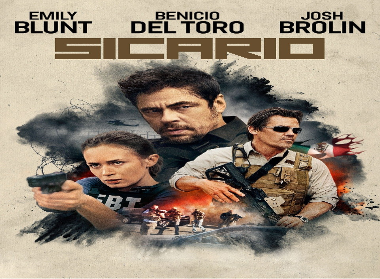
Sicario (2015)
Denis Villeneuve’s Sicario brilliantly utilizes dark, desaturated colours through its visuals and thriller story, showcasing the lighting take for such an aggressive war (Dunham, 2021). Released in 2015, the movie is a riveting investigation of the moral ambiguities and horrific reality that underlie waging war against drug cartels. With cinematographer Roger Deakins, Villeneuve uses a type of visual language steeped in darkness that ups the tension and makes any viewer feel more apt to react viscerally while embedding oneself deeply within an unsettling world belonging to such characters.
However, the dark and somberness of desaturated colours used in “Sicario” are seen from its early premise to provide a visceral, thrilling theme. Villeneuve uses a greyscale that is mainly one of deep blacks, cold greys and expressionless blues to create an environment similar in potential to the subject matter’s seedy moral world and its dangers. One of the primary functions of the film Sicario, which uses a darker palette, is to build tension throughout (Matt, 2020). Villeneuve’s expert use of colour as a tool dramatically and visually magnifies the scene’s psychological and emotional meaning. The desaturation adds to the somberness of their feelings towards Mtoward and all humans, leading them to wonder why they act that way. Meanwhile, in the broad landscapes of distant America to come were darksome blacks foregrounding dual issues – their impact being pandemic for increased dramatic tension and is this all about. Again! Placing a hybrid colour scheme is also paramount in obtaining emotions through this perception.
Secondly, the dark colour scheme acts as an idealized symbolic postulate for motifs considered fundamental in “Sicario” – like a mediate sign. Given the situational dilemma where morality is difficult to discern, desaturated colours declare a character’s self-descriptions in their proximal or distant relationship with either true or false choices. Unlike dark visual storytelling Vi, Villeneuve goes beyond the barrier transgressing because a thriller would only be responsible for adding shades in its considerations on righteousness and custody. However, Villeneuve’s tight control of lighting and shadows further emphasizes how far in darkness one is immersed.
The dark palette also contributes to making the film take place under a general feeling of suspense. Villeneuve manipulates colours to influence time and rhythm in the audience. Continuing, the monotone colours and parade fes crunching speed sustained a nonstop ambiance of tension. However, the innocent, passive movements of the two protagonists stand out spectacularly even against a landscape made up of trim colour and remain in its suspense tone throughout. As for the dark palette, it is transformed into a tool indispensable to create action scenes in films. Villeneuve’s attention is not on the action of having the audience stunned with scenes that explode, but tension and release are highlighted. This rating is relevant because with such desaturated colours—individual gunshots and confrontations become more enhanced; the resulting pressure on each violent moment makes it both visceral and emotional. The viewers are not only spectators of action but also enter into the characters’ desperate fight for their lives.
In addition to the primary purpose, a dark palette found in “Sicario” also plays an essential role in the film’s lingering impact on its viewers. Villeneuve’s film visual selections remain in our minds, leaving us with a gloomy who stays in the atmosphere of the screen. The colourless pigment intensifies emotionally and psychologically deepens the characters’ transformations, remaining envisaged and consolingly entwined with the complex themes of the movie. As an art of visual storytelling, “Sicario” by Denis Villeneuve is prone to the exciting fact that this director uses dark and desaturated colours as his strategy. Using a dark, sombre colour palette intensifies the tension. It elicits physical responses in viewers while creating an immersive environment for them to immerse themselves in its morally ambiguous and dangerous world. Villeneuve’s visual choreography of darkness far exceeds the canons of the crime thriller genre and creates a ground-breaking cinematic journey in entertainment; psychological depths and realities are explored.
CHAPTER 3
Psychological Effects on the Audience
Denis Villeneuve’s cinematographic art goes deeper than just the cleverness in narrative plot and with the finesse of character building as he creates not only a visual masterpiece but mirrors psychic responses from the audience. By studying the psychological aspects of colour in his films, including cognitive and emotional responses, mood and atmosphere and narrative intelligibility from an evaluative perspective that transcends the scope of cinema onto spectators’ minds, we touch upon directorial conscious decisions which inform huge circles inside other cultural boundaries (Hellerman, 2023).
Cognitive and emotional responses to different colours
Villeneuve’s knowledge of colour psychology demonstrates itself in the cognitive and emotional reactions that his films give rise to. The innate quality of colours makes us feel determined emotions and thoughts. In “Blade Runner 2049,” by using the cold blues and harsh oranges, this scene creates a visual language for viewers he allows you to read into their subconscious. The blues generate an effect of isolation and alienation, which matches the theme addressed in this film: issues related to existential questions. At the same time, fiery shades of orange increase psychological pressure in critical episodes, enhancing emotional power. By deliberately controlling the colour, Villeneuve evokes cognitive associations that help viewers follow a stream of emotions throughout, intensifying their perception (Take, 2020).
In “Arrival,” a more muted and earthy colour scheme contributes to the reflective tone, leading one’s mind outwards. The softened sounds, evoking a naturalistic look and feel, encourage the observer to reflect and contemplate on concepts elaborated by the film. Villeneuve uses muted tones as a visual indicator for the cerebral journey, enabling cognitive integration into the protagonist’s process of extraterrestrial communication. The sophisticated handling of the colour renders an intellectualized spectatorship possible, where the audience does not merely behold but engage in co-participating with a film’s action as thought.
“Sicario” utilizes the saturation of dark and half-tone colours in a way that evokes psychosomatic responses to complement the characters’ horrific reality at drug cartels. The muted colours add more tension, scare viewers, and plunge them into the saga’s psychological drama. The colour control of Villeneuve becomes a psychological motif, steering the cognitive judgments of danger and morality.
Influence on mood and atmosphere
Although colour serves as an essential representative of visual language, it has a natural power to evoke mood and atmosphere inherent in which Villeneuve uses extremely skillfully (Matt, 2020). The striking palette – neon-drenched, cool blues and warm oranges suffuses a futuristic atmosphere with emotionally charged tension in “Blade Runner 2049.” In the same way, the contrast of these colours reflects the human-machine relationship as portrayed in the computer universe. Villeneuve’s precise management of film mood through colour selections yields an imagery background that aligns with advanced narrative meanings.
The movie Arrival provides a unique ambiance created through muted and earth-tone colours. The muted shades from greyish to brown will create a meditative mood which correlates with the topic discussed in this film – time, language and what expresses human connection (Ulubay, 2023). Villeneuve successfully uses colour to manipulate mood, deepening the film’s emotional agility, which tells on us as members of the viewing audience, for it makes hits possible for us to engage with the narrative more intimately introspected.
This technique is used by the movie “Sicario,” this film chose dark, cold, desaturated colours to create a feeling which makes it easy for the audience not to get away with the situation of suspense that they are adding oppression to their atmosphere. The muted colour serves in the second line of the drug trade to heighten the tension and danger.
Impact on narrative comprehension and engagement
The way colour becomes one driving element for narrative comprehension while controlling audience engagement in Villeneuve’s films is a complex aesthetics. The intricate plot structure from “Blade Runner 2049” is used to administer colours that become tools working through visuality in storytelling. Villeneuve’s strategic use of colour promotes visual symbolism to engage readers with the narrative.
In “Sicario,” the colours are dark and desaturated, but they do not simply emphasize darkness; instead, they play an active role in building suspense and ambiguity. Colour in Villeneuve’s film becomes a storytelling device mainly because it enhances audience engagement by amplifying emotional and psychological risks. The visual language created through colour never lets the viewer become a passive observer but always an active participant in the development of narration.
CHAPTER 4
Comparisons across Villeneuve’s filmography
Villeneuve’s strong visual style is characterized much more than by compelling narratives but also by precise colour. In roaming his filmography, we focus upon a fascinating story, one of the returned colour motifs that designate evolution in colour use and relate to cinematographers’ deliberate decisions.
Identification of recurring colour motifs
In the context of Villeneuve’s filmography, it is remarkable that colour motcolourrering across various stories but belongs to a particular narrative and instead forms one coherent visual language. In Blade Runner 2049, the neon-soaked range with its cold blue and fired oranges becomes an iconic leitmotif that intersects in the film representation of artificial intelligence, dispatching outlines between human and technical. This recurrent aesthetic motif reinforces other thematic elements in his work and sets a visual signature that marks Villeneuve’s precise manipulation of colour as one created for narrative purposes.
Like that, the subdued and ground-based colour palette of “Arrival” becomes one constant motif which indicates Villeneuve’s thoughtful storylines. The shades, from dusk-grey to chocolate brown, become the emotional equivalent of time and language in this film; they are human connections. This recurring motif contributes to Villeneuve’s storytelling by making the picture thread that connects different narratives into a single thematic cover.
In ‘Sicario,’ another motif characterizing Villeneuve’s approach to moral intricacies and frightening truth is represented with dark but restrained colours. The continued rope of desaturated tones accentuates tension and makes us react to this turmoil viscerally. By using these motifs in various genres, Villeneuve demonstrates his adeptness at using colour as a narrative tool, almost like a fingerprint.
Evolution of colour usage in the director’s career
In evaluating Villeneuve’s filmography, one can see an intriguing development in his usage of colour with each project that reflects the path of a director who strives to experiment and perfect her skill. Unlike his other early works, such as “Maelström” and “Polytechnique,” the colour palette is relatively subdued, which can be seen as a preliminary attempt by the director to create visual storytelling. As Villeneuve’s work evolves, the trend changes, whereby the choice of colours becomes braver and more alive.
However, the transformation becomes clear in “Incendies,” whereby the colour palette is a mild yet essential storytelling character. The subdued colours in this film prefigure the finding of meditative ambiences that will serve as a central theme for Villeneuve’s palette. The growth is palpable as he goes deeper into genres such as science fiction with ‘Arrival’ and ‘Blade Runner 2049’. The director uses vibrant neons, cold blues, and warm oranges, testaments to a newfound knowledge and expertise in employing colour that amplifies the complex nature of his stories.
Sicario is a starting point in Villeneuve’s colour development because, from this film onwards, he uses an intense and foreboding dark palette that makes up the signature of his further films. The advancement from softer colour accents to stronger thematic picks points out the discernible development of the director in the non-decorative application, but one involving colour as more than a passive prop and an active influencer on story elements and the audience’s perception.
Influence of cinematography and production design on colour decisions
The involvement of the cinematographers and production designers with whom Villeneuve collaborated in his colour choice is critical. Blade Runner 2049 is a further synergy with cinematographer Roger Deakins. Villeneuve’s triumph of colour choice, in addition to the mastery by his partner adding visually enthralling frames, formulate a stunning world dystopia, aesthetically beautiful and complex storytelling process – ND The composite set design also deepens the aesthetic texture of the film in a way that cannot be construed as an unnatural approach to colour otherwise woven into this tapestry.
As in ‘Arrival,’ Bradford Young’s cinematography acts as a partner filmmaker to Villeneuve, morphing his colours into frames. A deft colour is represented through the cinematography with a countenance that can make contemplating state up to thoughts and uplift emotions’ relevancy. The production design, from these unknown alien ships to the settings of all characters, somehow complements Villeneuve’s colour choices wonderfully and provides a unified, consistent message that weaves through this film.
In Sicario, collaboration with Roger Deakins proves decisive again. The low darks and desaturated colours are not the work of a director acting alone but part of an interwoven tapestry seamlessly woven into Deakins’ visual narrative. The sharp contrast of the barren landscapes and elaborate production design work reinforce the presence of a dark palette, eventually making it intense and suspenseful, thus also a dark movie.
CHAPTER 5
Conclusion
In conclusion, the investigation of Denis Villeneuve’s colour management showed us an entirely new tapestry where colours serve as some language to reveal emotions and moods and bring out prejudice. There were recurring colour motives all over Blade Runner 2049, Arrival and Sicario, which the viewers navigated through thematic landscapes while portraying Villeneuve’s developing elaborate colour palette. The cooperation with cinematographers and production designers, however significant it may have been for the director’s meticulous utilization of colour as an element in his storytelling fabric.
This study is critical in understanding Villeneuve’s directorial style, including intentional decisions within each colour palette. The neon-soaked futurism, subdued contemplation, and intense desaturation are all elements that form part of a directorial signature. This fingerprint goes beyond storytelling and thus makes Villeneuve the master visual narrative center stage punctuation further endeavour. Artistic colour psychology in movies has the potential to explore the more subtle influence of different hues on the audience’s perceptions and emotions. Two such areas are taking a cross-cultural look at colour associations in films, probing the psychic dynamics of changes to colours within one film and analyzing how titers can inform immersion into a cinematic experience. Recognizing this complex colour and psychology interaction not only makes us appreciate Villeneuve but also helps broaden an understanding of what visual elements mean in the experience of film audiences.
References
Baker, L., 2021. How Denis Villeneuve’s Blade Runner 2049 Perfected the Art of Color Theory. https://www.premiumbeat.com/blog/symmetry-color-cinematography-blade-runner/
Bartos, B., 2020. How do colours enhance and ease viewer immersion in the fictional reality of a film? An exploration of the affective nature of colour usage in film. https://d1wqtxts1xzle7.cloudfront.net/64639137/BA_2940760_B_Bartos-libre.pdf?1602287806=&response-content-disposition=inline%3B+filename%3DHow_do_colors_enhance_and_ease_viewer_im.pdf&Expires=1705653175&Signature=FUmAE0l9fZsJAbURPonYiBpiUQ8M0-xD0MBeBZ81~UFPuoYT5HtreLNHs-iFLD-OGahUqP5dax8xwuQMIL171uG58ge.
DiGioia, A., 2021. More Human than Human: Blade Runner 2049. In Gender and Parenting in the Worlds of Alien and Blade Runner: A Feminist Analysis (pp. 11-30). Emerald Publishing Limited. https://doi.org/10.1108/978-1-83982-940-620210002.
Dunham, B., 2021. Sicario Cinematography Explained — Lighting & Composition. https://www.studiobinder.com/blog/sicario-cinematography-explained/
Elyamany, N., 2023. Postcyberpunk dystopian cityscape and emotion artificial intelligence: A spatial-cognitive analysis of posthuman representation in Blade Runner 2049 (2017). Convergence, 29(5), pp.1199-1225. https://journals.sagepub.com/doi/abs/10.1177/13548565221122913
Frkáň, L., 2020. SPECIAL EFFECTS IN CINEMATOGRAPHY. https://dspace.vut.cz/server/api/core/bitstreams/ff95d2ec-91c9-46bc-9dd6-39a15afbf310/content.
Hellrman, J. F., 2023. The Psychology of Color in Film (with examples). https://nofilmschool.com/color-psychology-in-film .
Leighfield, L., 2023. How to Use Color Theory in Film. https://boords.com/blog/color-theory-in-film .
Matt, C., 2023. Mastering the Movie Color Palette: The Denis Villeneuve Way. https://filmlifestyle.com/movie-color-palette-denis-villeneuve/.
Matt, V., 2020. Mastering the Movie Color Palette: Denis Villeneuve. https://www.studiobinder.com/blog/movie-color-palette-denis-villeneuve/
Risk, M., 2020. How to Use Color in Film: 50+ Examples of Movie Color Palettes. https://www.studiobinder.com/blog/how-to-use-color-in-film-50-examples-of-movie-color-palettes/ .
Rothstein, A., 2020. Color Theory in Film: A Video Producer’s Guide. https://www.ipr.edu/blogs/digital-video-and-media-production/color-theory-in-film-a-video-producers-guide/
Take, B. T., 2020. How a Film’s Color Palette Psychologically Affects the Viewer. https://medium.com/@thebtake/how-a-films-color-palette-psychologically-affects-the-viewer-2ea5320de8d9 .
Ulubay, G. 2020. “Arrival” Isn’t a Horror Movie, but it’s Terrifying in its Own Right. https://gabrielleulubay.medium.com/review-arrival-denis-villeneuve-2016-6ebf2b3a52ab.
Zhang, C., 2020. The cinematic possibilities of painting (Doctoral dissertation, 00500:: Universidade de Coimbra). https://hdl.handle.net/10316/101868.
 write
write