Introduction
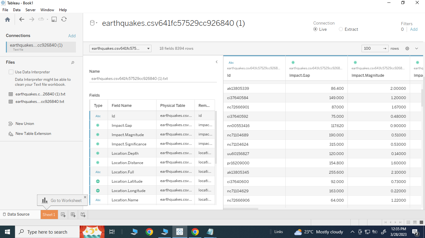
The main focus of assignment five is working as a team. The fifth group demonstrated everything we had learned in class. Group 5 decided to use the earthquake dataset for this assignment. According to (Mousavi et al., 2019), labeled datasets are required for building supervised models, but earthquake label reliability in seismology is highly variable. As a result, the authors describe the data collection, quality control procedures, and processing steps they took to ensure that earthquake and non-earthquake signals were labeled correctly. The authors hope that this dataset, dubbed STEAD, will provide new and unprecedented opportunities for seismologists and others to gain new insights from seismic data using machine learning techniques. This dataset contains 8394 data records with eighteen different types of attributes:
- Id: The unique identification of the seismic event.
- Gap: The most significant azimuthal separation between azimuthally neighboring stations that recorded the event in degrees.
- magnitude: The energy released at the source measures the event’s importance.
- significance: A subjective value expressing the importance of the event.
- depth: The depth of the earthquake in kilometers.
- distance: The distance in kilometers between the epicenter of the earthquake and the nearest city or town.
- full: The full name of the epicenter of the earthquake.
- latitude: The latitude of the earthquake epicenter in decimal degrees.
- longitude: The longitude of the earthquake epicenter in decimal degrees.
- The state, province, or region in which the earthquake occurred.
- day: The month when the event occurred.
- epoch: The Unix timestamp of the event.
- Complete: The event’s completion date and time.
- hour: The time of day that the event occurred.
- minute: The hourly minute at which the event took place.
- month: The calendar month when the event occurred.
- second: The second of the minute when the event occurred.
Ample data was available for analysis from the dataset’s 8394 records. The dataset contained all the values. There was only one outlier value, 5.8, from the “impact. magnitude” attribute information. This was removed because the remaining records ranged from 0.1600 to 5.500. The primary analysis was better to understand the mechanics and patterns of earthquake occurrence. Group 5 identified the unique identification of the seismic event as the dependent attribute variable.
Figure 1 Earthquake data
Data Exploration:
One possible visualization in Tableau for the earthquake data would be creating a map that displays each earthquake’s location name, impact gap, and distance.
During the initial state of explorations, specific questions were raised by Tableau. Tableau is a powerful data visualization tool that can create interactive and dynamic visualizations of various data types, including earthquake data. It can explore the data further by filtering the earthquakes based on different criteria, such as magnitude or location, or adding additional fields to the visualization.
Questions: Which location had the highest impact magnitude?
What is the relationship between impact gap and impact significance?
How does location depth correlate with impact magnitude?
Is there a correlation between impact significance and location distance from the epicenter?
These initial questions demonstrated certain predictive solid relationships throughout the dataset, which were the basis of group 5’s choosing for dependent attribute variables of impact. Magnitude and “effect. Significant as the targets when creating the two decision tree models.
Data Visualization Process and Results
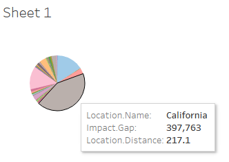
The data visualization process for earthquake data was done using Tableau and involved several steps, including data preparation, exploration, visualization, and interpretation. During the data preparation stage, the data was cleaned and transformed to ensure it was in a format easily visualized. The exploration stage involved creating scatter plots, histograms, and pie charts to identify patterns and trends in the data. For instance, the data visualization for California resulted in the following histogram.
Figure 2 California Impact magnitude
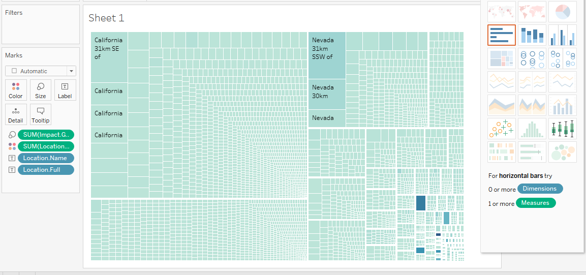
Once a deeper understanding of the data was achieved, advanced visualizations were created using Tableau, such as heat maps, geographic maps, and interactive dashboards, as shown in the appendixes. These visualizations were used to identify spatial patterns in the data and relationships between variables. Finally, the interpretation stage involves drawing conclusions about the data patterns and trends, which can be used to make future research or action recommendations. Tableau is a powerful tool for visualizing earthquake data, helping to identify risks and mitigate the impact of earthquakes on communities and infrastructure.
Decision Tree Predictive Model
A Decision Tree Predictive Model was also applied to earthquake data to predict earthquake occurrences or outcomes. The model can identify the significant predictors that lead to earthquakes and predict the magnitude, location, and time of the next earthquake. The results of a Decision Tree Predictive Model for earthquake data are typically presented in the form of a tree diagram that illustrates the hierarchy of features and thresholds that lead to the occurrence of an earthquake. The tree’s root represents the initial feature, which in this case could be the geological characteristics of the region or the tectonic plate movements. The tree branches into different levels, with each group representing a feature or a combination of elements that contribute to the occurrence of an earthquake. The final leaves of the tree represent the prediction outcomes, such as the likelihood of an earthquake occurring in a specific location, the magnitude of the earthquake, and the time of occurrence. The results of a Decision Tree Predictive Model can help to identify high-risk earthquake zones and improve disaster preparedness by predicting the likelihood of an earthquake, its magnitude, and its location. Additionally, the model can help inform policy decisions related to infrastructure and building codes in high-risk areas, leading to more resilient communities and reduced earthquake-related casualties and damages.
Discussion
Earthquake visualization analysis is a powerful tool for exploring and understanding earthquake data. By creating interactive and dynamic visualizations, it is possible to identify spatial patterns and trends in the data and to communicate complex information to a broad audience.
One of the critical benefits of earthquake visualization analysis is that it allows researchers and decision-makers to identify high-risk earthquake zones and develop disaster preparedness and response strategies. For example, by visualizing earthquake occurrences on a map, it is possible to identify areas where earthquakes are most likely to occur and allocate resources accordingly. Similarly, by visualizing earthquake magnitude and depth, it is possible to identify areas where buildings and infrastructure are most vulnerable to earthquake damage and to develop policies and regulations that mitigate this risk.
Another benefit of earthquake visualization analysis is that it allows researchers to explore the relationships between different variables, such as the relationship between earthquake magnitude and location or between earthquake occurrences and tectonic plate movements. By visualizing these relationships, it is possible to develop more accurate predictive models and to identify new research questions that can improve our understanding of earthquake mechanics and geology.
Storybook
Earthquake data visualization and analysis explores, interprets, and communicates patterns and insights in earthquake data through visual tools and techniques. The objective of earthquake data visualization and study is to identify trends and practices in the data that are not immediately apparent through statistical analysis alone. This approach can help scientists, policymakers, and emergency response teams better understand earthquake mechanics and develop disaster preparedness and response strategies.
Data visualization and analysis techniques may include using interactive maps, graphs, charts, and other visualizations to explore relationships and patterns in the data. Using these tools, analysts can identify patterns in earthquakes’ frequency, magnitude, location, and other characteristics and uncover connections between these variables and other factors, such as human activity and geological features.
Reference
S. M. Mousavi, Y. Sheng, W. Zhu, and G. C. Beroza (2019). Stanford Earthquake Dataset (STEAD): A global data set of seismic signals for artificial intelligence. IEEE Access, vol. 7, no. 7, pp. 179464-179476.
 write
write